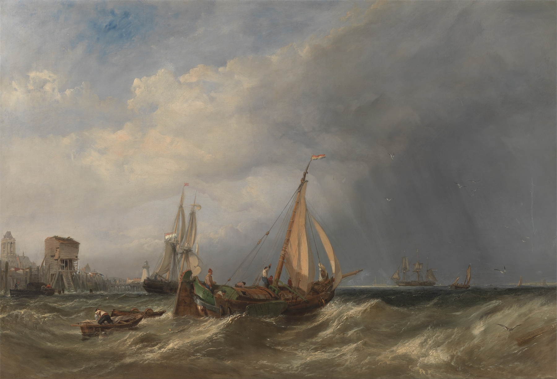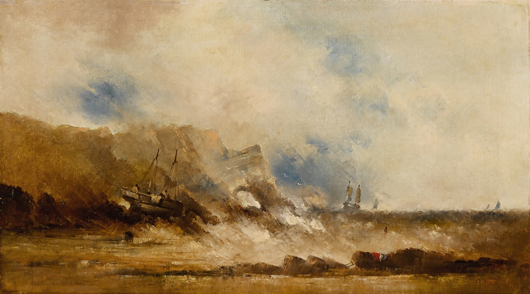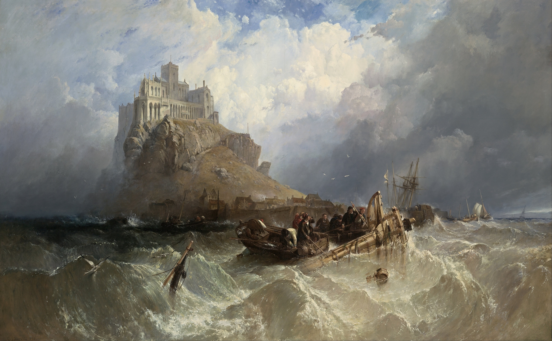
Tilbury Fort–Wind Against the Tide — History & Analysis
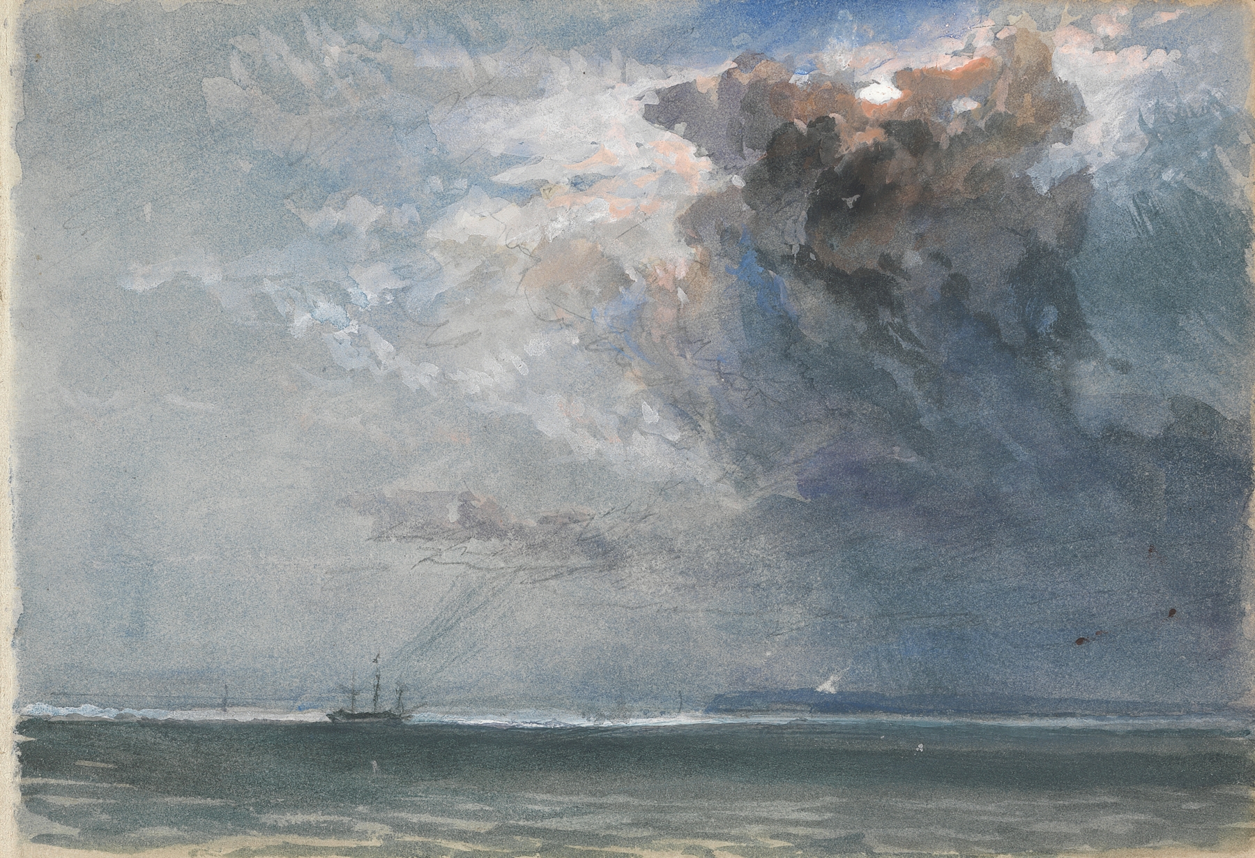
When did color learn to lie? In Tilbury Fort–Wind Against the Tide, vibrant hues dance with an unsettling truth, beckoning us to probe deeper into the illusion of serenity. Focus first on the dramatic interplay between the stormy sky and the tranquil waters below. The artist's deft brushwork brings the clouds to life, swirling with shades of grey and blue that seem to pulse with energy.
Notice how the sunlight breaks through, glinting off the waves, creating a stark contrast that captures both beauty and foreboding. The fort stands resolute on the horizon, a steadfast guardian against the elements, yet its very presence hints at vulnerability amid nature's fierce turmoil. The painting teems with tension; the wind, palpable even from afar, pushes against the fort's sturdy walls, suggesting an unyielding struggle. The boats gliding in the foreground symbolize mankind’s fragile endeavor against nature’s might, representing a dance of persistence and futility.
Each stroke reveals a juxtaposition between calm and chaos—a reminder that creation can often masquerade as destruction, while unyielding forces lie in wait just beyond our perception. Clarkson Stanfield painted this work during a tumultuous period in the mid-19th century, when the romanticization of nature was at its peak. Living in England, his landscapes reflected the contemporary interests in maritime themes and the sublime. As industrialization surged, artists began to explore the relationship between humanity and the natural world, capturing the conflicts and tensions that define existence.