
Titelprent voor prentreeks 'De boetvaardige heiligen' — History & Facts
When did color learn to lie? The vivid hues of a printed scene can reveal truths that linger just beneath the surface, waiting to ignite a moment of revelation. Focus first on the intricate details woven throughout the composition. The central figures, saints caught in pensive repose, command immediate attention with their expressive faces and elaborate garments. Take a moment to absorb the striking contrast between the deep, rich reds and soft, muted earth tones that Bosse employs to convey both sanctity and human vulnerability.
The interplay of light and shadow dances across their forms, revealing the depth of their emotional turmoil and the weight of their penitence. As you explore the edges of the artwork, notice the delicate linework that outlines each saint, a testament to the artist's skill and intention. The carefully arranged elements—symbols of repentance and divine grace—invite contemplation on the tension between earthly desires and spiritual redemption. Here, color serves not merely as decoration but as a catalyst for understanding the inner struggles faced by these holy figures, urging viewers to confront their own moral complexities. Abraham Bosse created this work in 1632, during a period when the art world was grappling with the transition from Renaissance ideals to Baroque expressions.
Living in Paris, he thrived amidst a burgeoning print culture that sought to democratize art. His engagement with these themes reflects not only his personal artistic journey but also the shifting societal values surrounding faith and morality in a time of profound change.
More Artworks by Abraham Bosse
Browse all →


More Religious Art
Browse all →
The Return of the Prodigal Son
Rembrandt van Rijn

The Garden of Earthly Delights
El Bosco
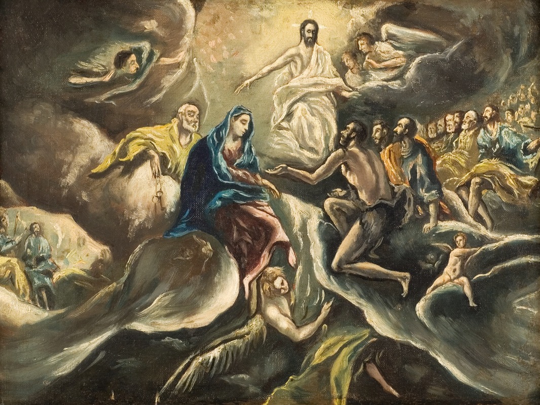
Count Orgaz’ funeral
El Greco

The Hundred Guilder Print: the central piece with Christ preaching, the plate arched
Rembrandt van Rijn
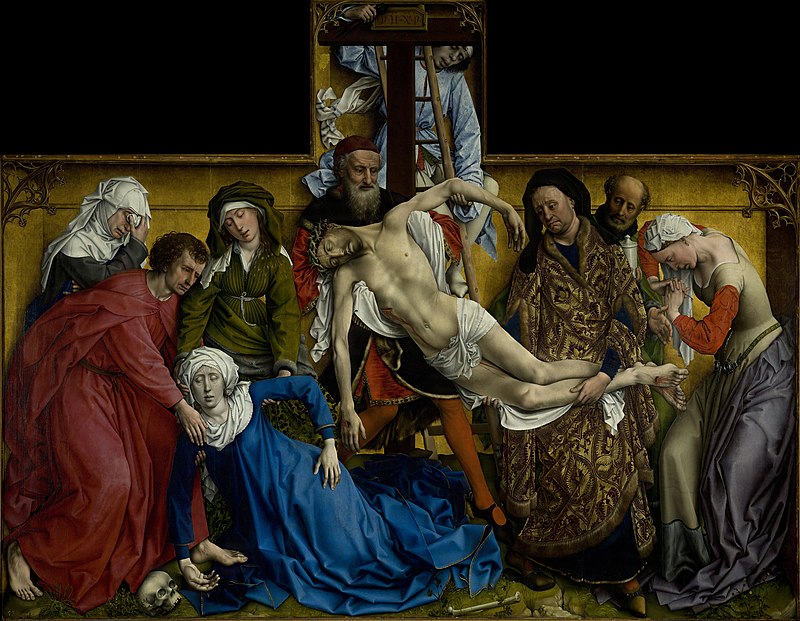
The Descent from the Cross
Rogier van der Weyden

The return of the prodigal son
Rembrandt van Rijn