Shell oil - Shell petrol - The supreme combination — History & Facts
Speed bursts from the page in Shell oil - Shell petrol - The supreme combination, where Jean d’Ylen captures the energy and optimism of the 1920s motor age. The eye is drawn instantly to two bold, triangular arrows—one red, one green—hurtling forward with the force of a locomotive, their points anchored by the proud, streamlined nose of a vintage automobile. The arrows are emblazoned with the Shell logo, each marked “OIL” and “PETROL,” and the stylized heads of Mercury—Roman god of speed—lend the composition a mythic sense of motion.
The car itself, rendered in inky charcoal, is dwarfed by these industrial wings, as if propelled by the very products they advertise. The palette is crisp and mechanical, with the red and green slicing through a paper-white ground, setting a tone of modernity and promise. This work belongs to the golden age of poster art, when companies like Shell turned to leading illustrators to create images that would not only sell but inspire. In 1925, the world was racing forward: automobiles were transforming cities, and oil companies vied to become household names.
Artists such as d’Ylen, working in the Art Deco idiom, distilled the era’s faith in speed, technology, and progress into striking visual shorthand—here, the fusion of oil and petrol as the “supreme combination.” The poster’s presence in the Gallica Digital Library is a reminder of how commercial art once shaped public imagination as much as any painting in a museum. Look again at the arrows and the car: you can almost hear the engine roar.
More Artworks by Jean d'Ylen
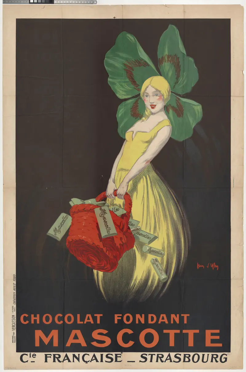
Chocolat fondant Mascotte. Compagnie française, Strasbourg
Jean d'Ylen
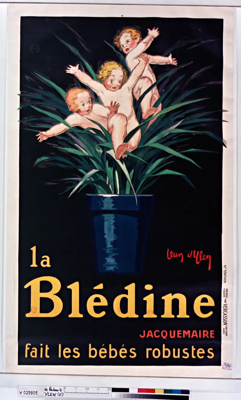
La Blédine Jacquemaire fait les bébés robustes : [affiche] / [Jean d'Ylen]
Jean d'Ylen
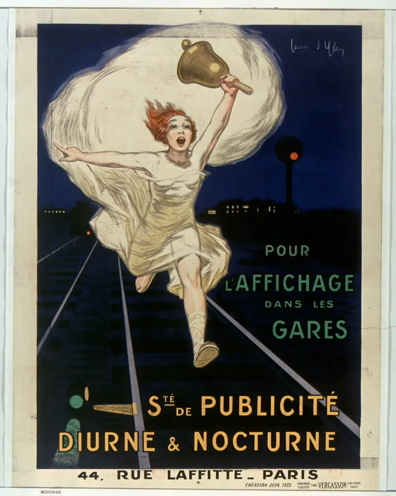
Pour l'affichage dans les gares Sté de publicité diurne et nocturne : [affiche] / [Joan d'Ylen]
Jean d'Ylen
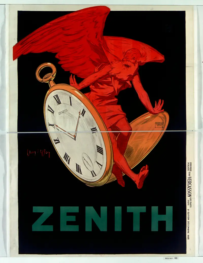
1928 advertisement poster - Zenith
Jean d'Ylen
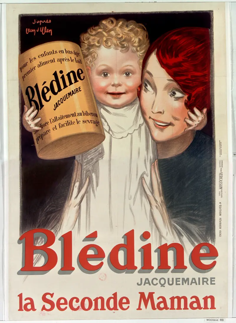
Blédine Jacquemaire la seconde maman : [affiche] / [Jean d'Ylen]
Jean d'Ylen
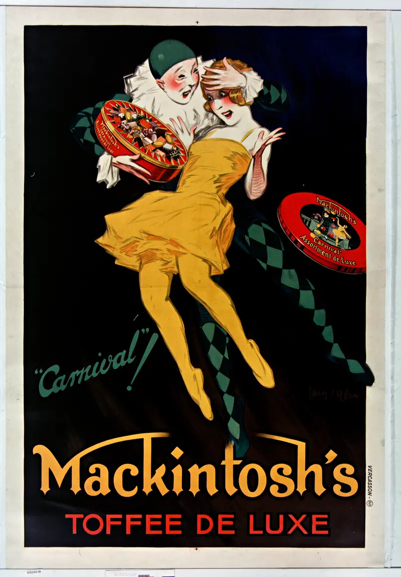
Carnival Mackintosh's, toffee de luxe affiche, Jean d'Ylen
Jean d'Ylen
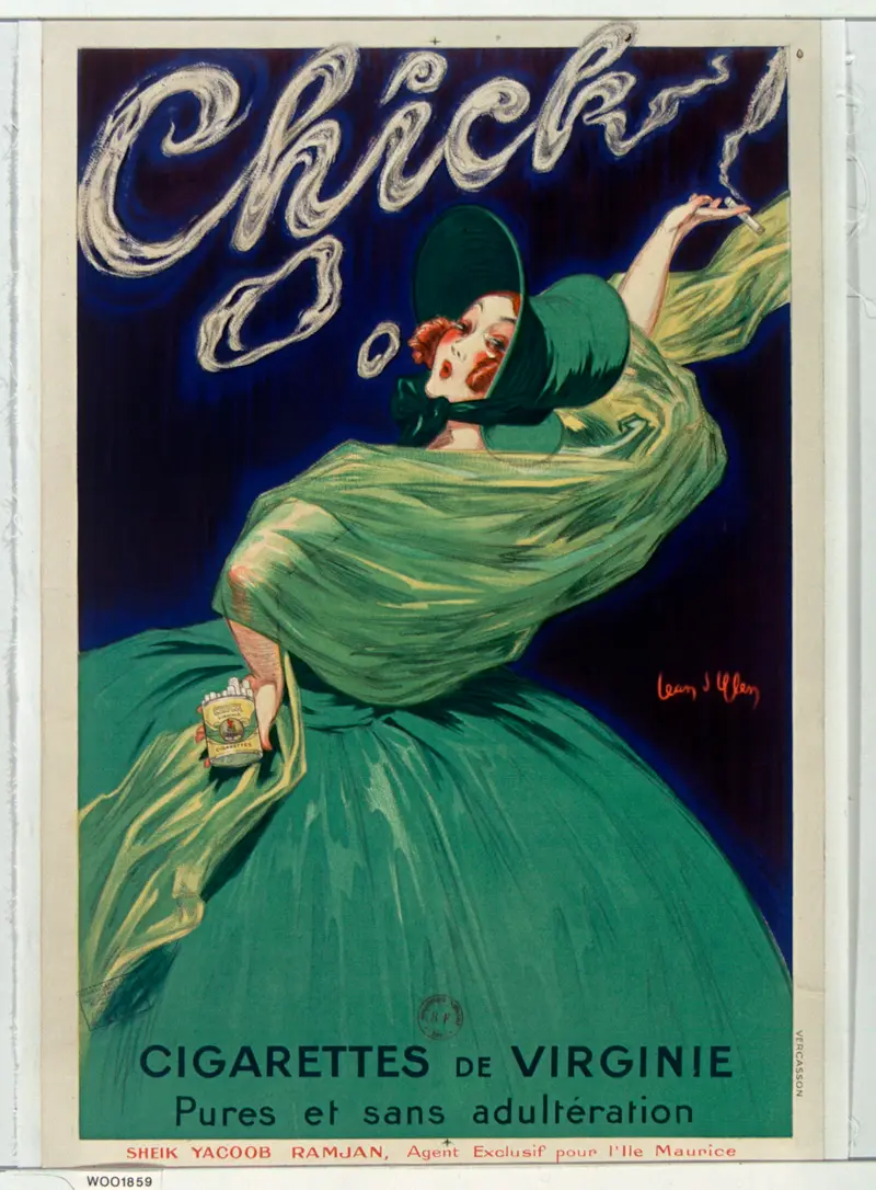
Chick cigarettes de Virginie pures et sans adultération : [affiche] / [Jean d'Ylen]
Jean d'Ylen
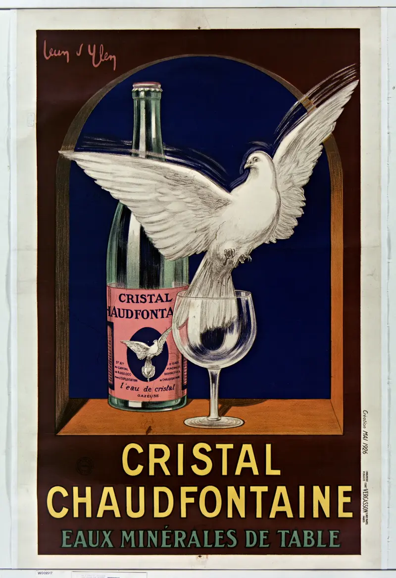
Cristal Chaudfontaine eaux minérales de table affiche, Jean d'Ylen
Jean d'Ylen
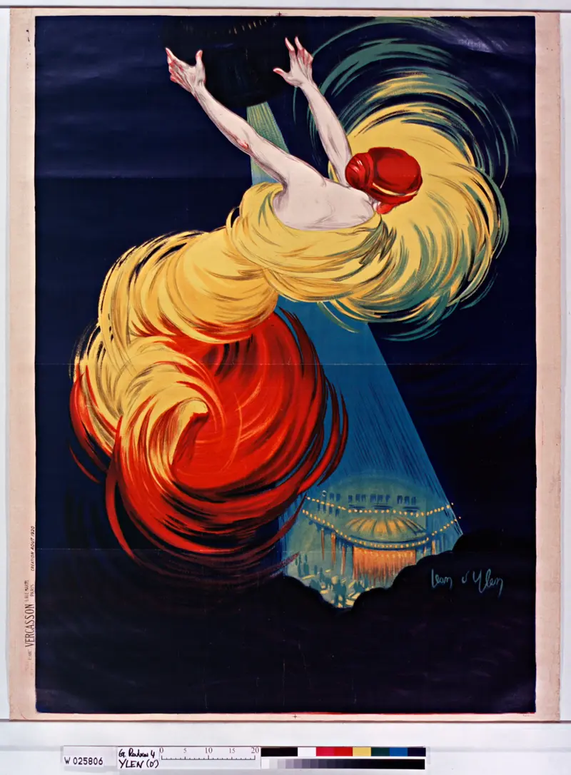
Danse de Moscou : affiche avant la lettre / Jean d'Ylen
Jean d'Ylen
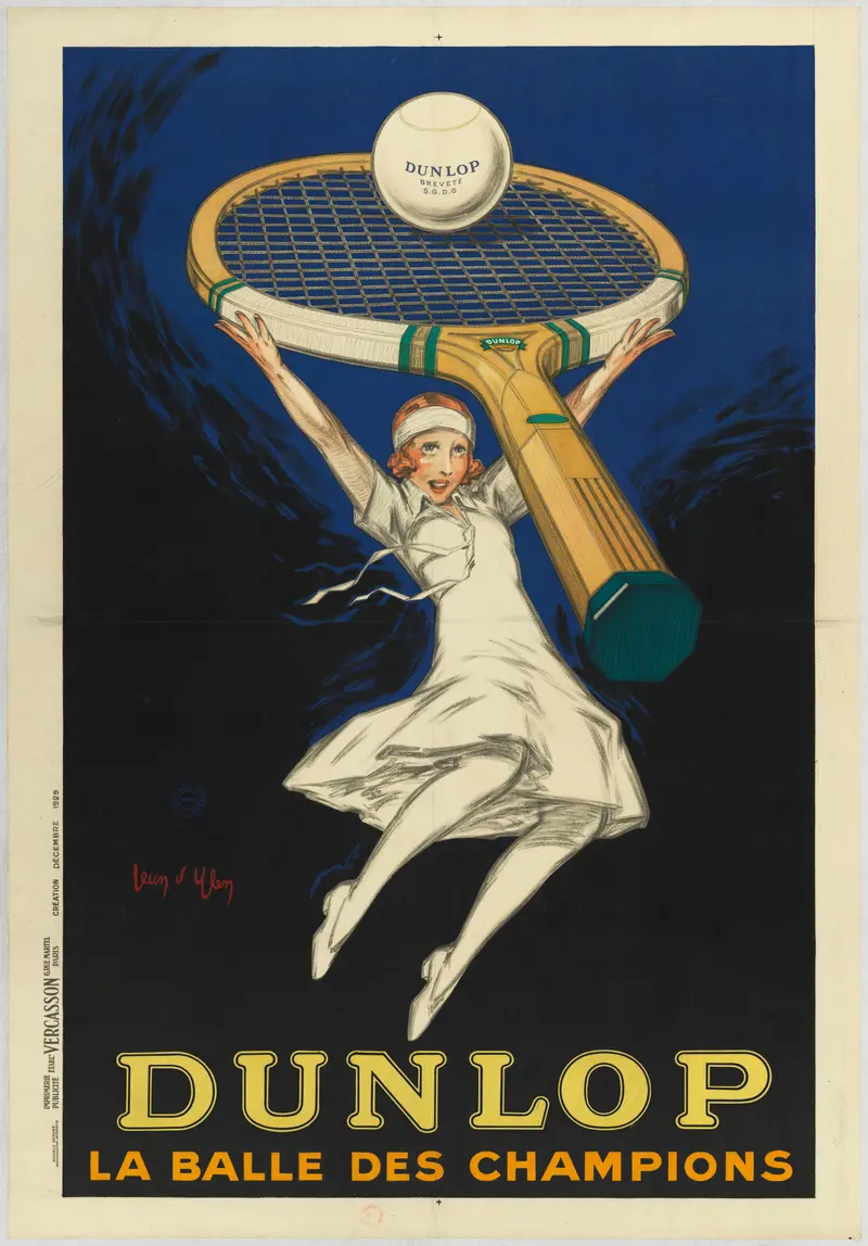
Dunlop la balle des champions : [affiche] / [Jean d'Ylen]
Jean d'Ylen