Is Polite Society Polite? — History & Facts
It is the boldness of the flowers that first catches the eye—great, stylized poppies blooming in coral and black, their forms curling and overlapping across the poster’s surface as if to challenge the very notion of polite restraint. The title, Is Polite Society Polite?, is framed not by delicate ornament but by these assertive blooms, their inky centers and looping stems pressing toward the text as if to ask their own questions. The composition draws the viewer inward: the heavy black outlines and flat fields of color echo the visual language of the Art Nouveau poster, yet here the organic forms serve not just as decoration but as a visual counterpoint to the genteel subject of the essays within.
The palette is limited but striking, the coral-pink background lending warmth while the black lends weight, suggesting both beauty and subversion. Created in 1895, this print by Ethel Reed belongs to a moment when the illustrated poster was both commercial tool and artistic manifesto. The late nineteenth century saw a surge in such works, especially in cities like Boston and New York, where publishers vied for attention in crowded urban landscapes. Posters like this one—commissioned to advertise books, performances, or products—were designed to be as memorable as they were informative.
Ethel Reed was one of the few women to gain recognition in this competitive field, her work now preserved in the Library of Congress. History has kept few traces of the journeys of individual posters, but the energy of their era still pulses in every curve and flourish; the question posed in the title lingers, inviting the viewer to look again and wonder what politeness conceals.
More Artworks by Ethel Reed
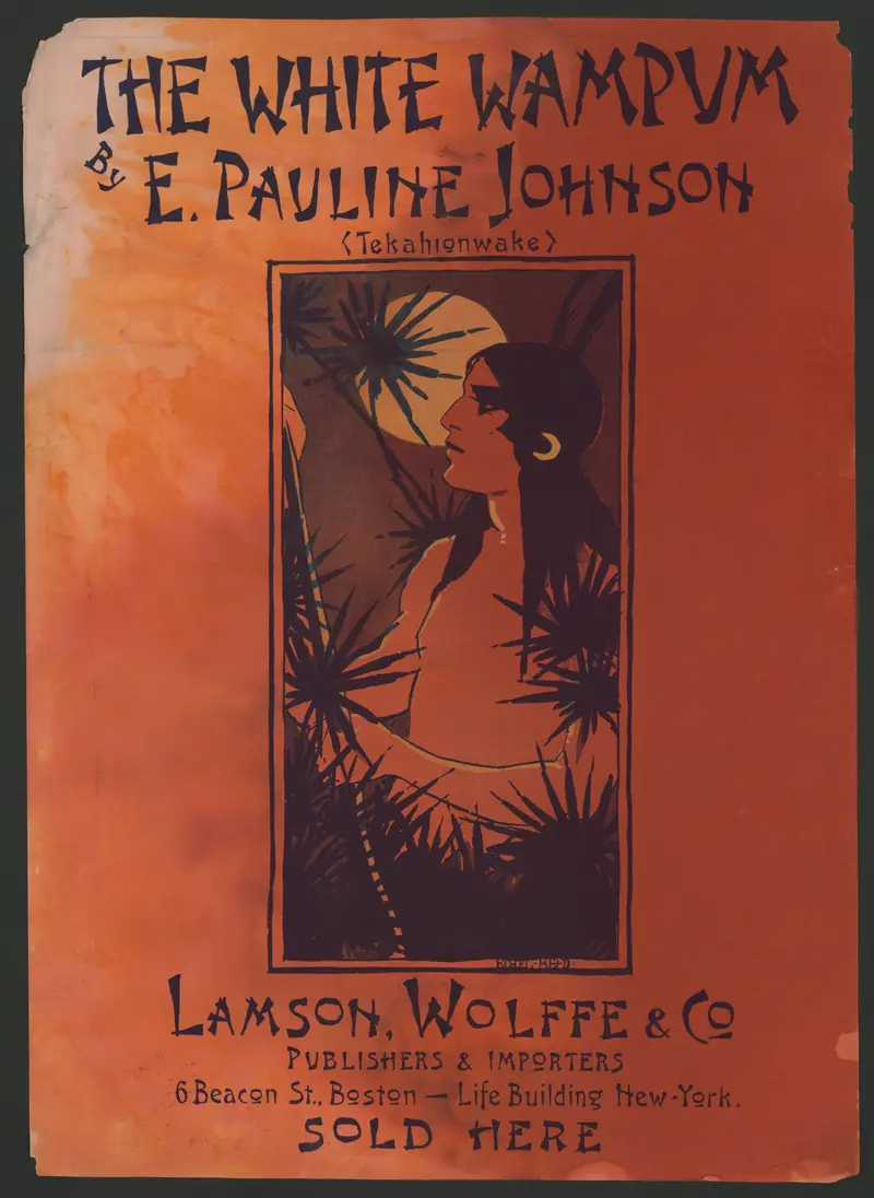
The White Wampum
Ethel Reed
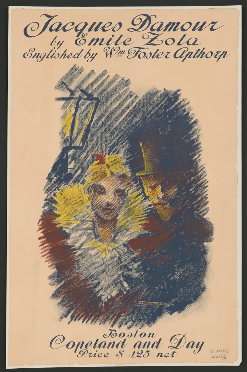
Jacques Damour
Ethel Reed
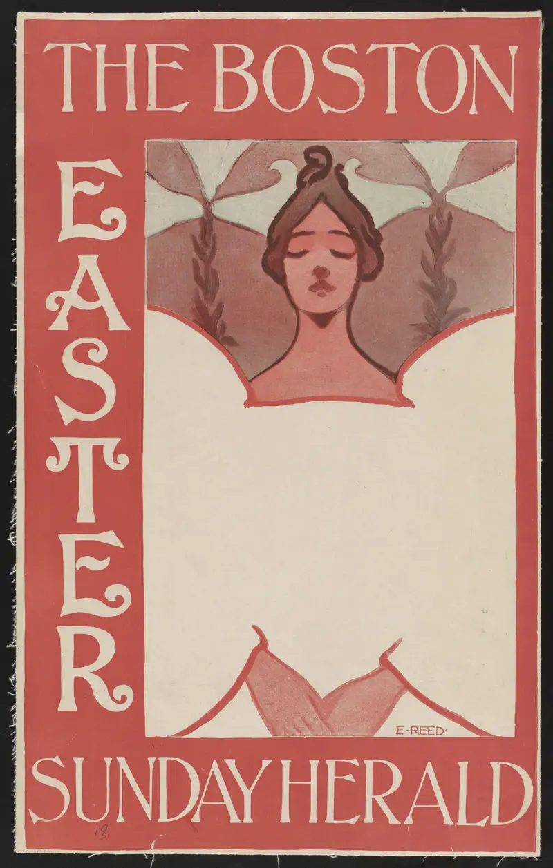
The Boston Sunday Herald: Easter
Ethel Reed
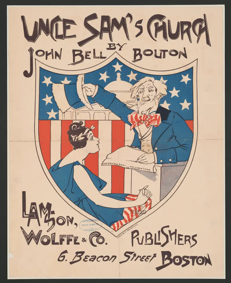
Uncle Sam's Church
Ethel Reed
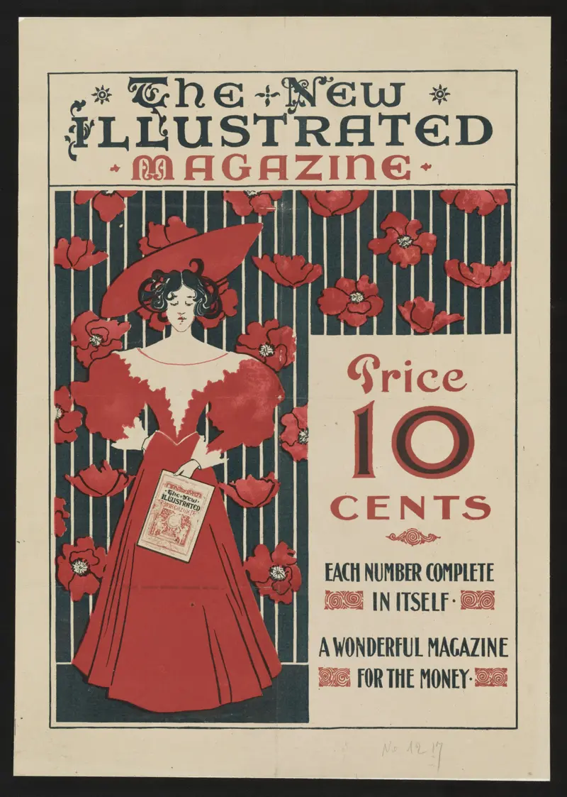
The New Illustrated Magazine
Ethel Reed
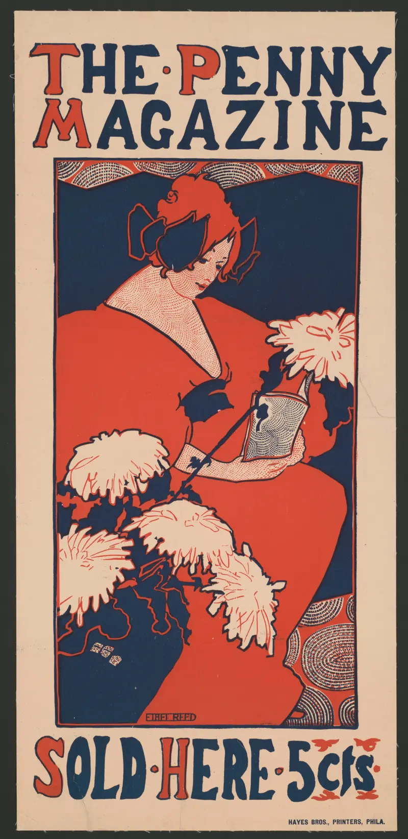
The Penny Magazine
Ethel Reed
Time and the Hour
Ethel Reed
Folly or Saintliness
Ethel Reed
Behind the Arras
Ethel Reed
Arabella and Araminta Stories
Ethel Reed