Berliner Börsen-Courier — History & Facts
A single sweep of blue, sharp against the stark cream and black, draws the eye to a woman’s cloche hat—modern, poised, and unmistakably urban. Her profile, all clean lines and pale blush, is set in perfect counterpoint to the more shadowed, angular face of the man behind her. Both are absorbed in the same act: reading, their gazes converging on the bold, red letters of the Berliner Börsen-Courier.
The composition is all tension and balance, the figures’ features almost abstracted, their forms cut by the curling edge of the newspaper itself. The artist, Hans Rudi Erdt, lets the typography do as much talking as the faces, making the poster itself a conversation between word and image, man and woman, public and private. This is 1913 Berlin, a city racing toward modernity, where posters like this one were the pulse of the street. Commercial art was undergoing a revolution—Plakatstil, or "poster style," stripped away clutter for bold shapes and striking color.
Commissioned by businesses eager to catch the eyes of a new, literate middle class, these works were printed by firms such as Hollerbaum & Schmidt, whose name appears discreetly at the bottom. The Berliner Börsen-Courier was a daily paper for both men and women, as the text proudly declares, and Erdt’s design makes that equality visible. History has kept few traces of the everyday posters that once filled Berlin, but this one survives, a fragment of a world where newsprint and modern life were inseparable—look again, and see how much story can unfold from a single glance.
More Artworks by Hans Rudi Erdt
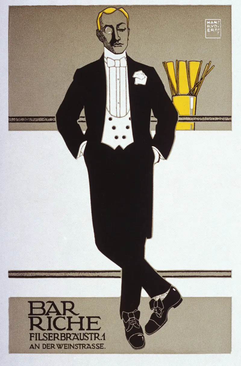
Bar Riche
Hans Rudi Erdt
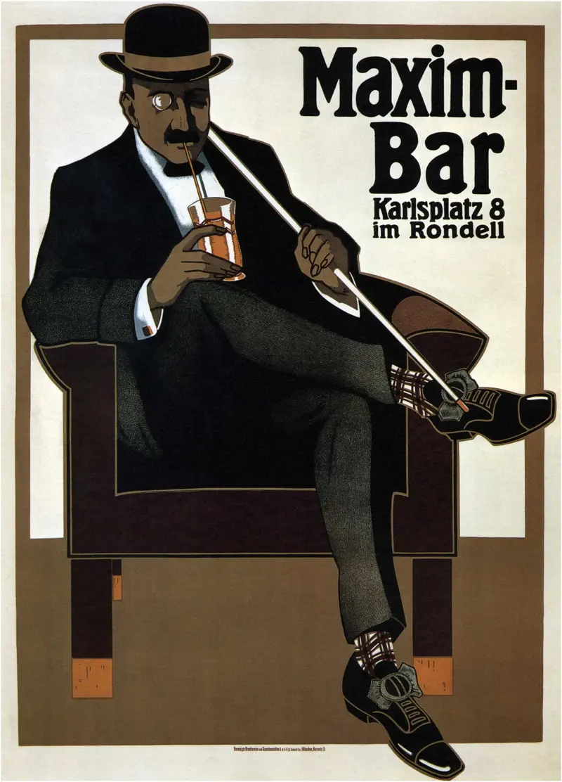
Maxim Bar
Hans Rudi Erdt
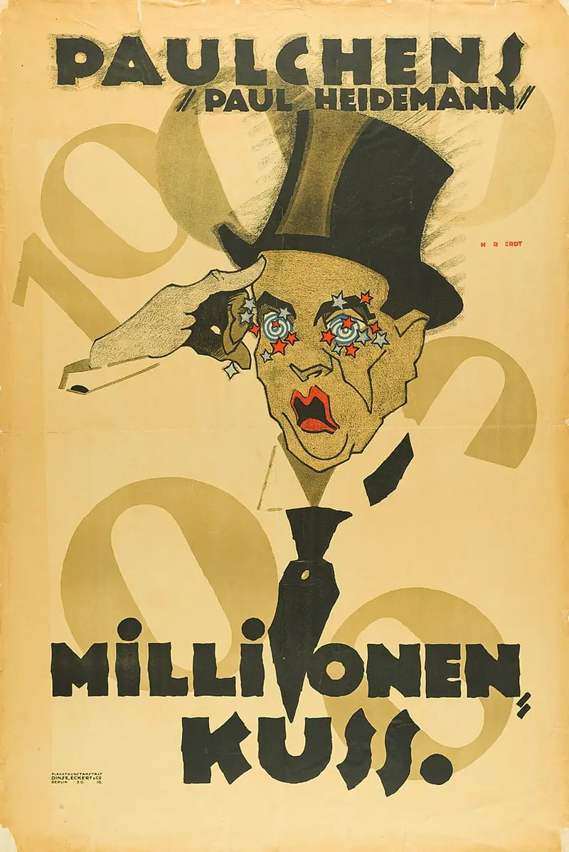
Paulchen's Million-Kiss
Hans Rudi Erdt
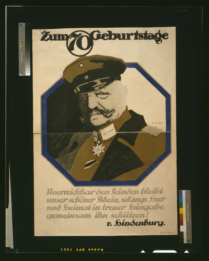
For the 70th Birthday
Hans Rudi Erdt
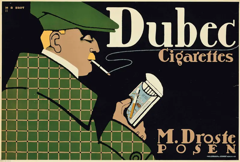
Dubec Cigarettes
Hans Rudi Erdt
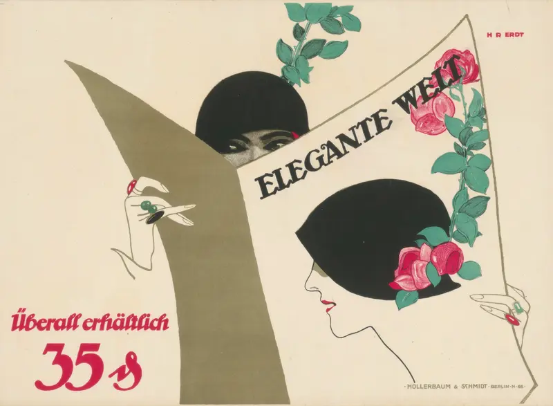
Elegante Welt
Hans Rudi Erdt
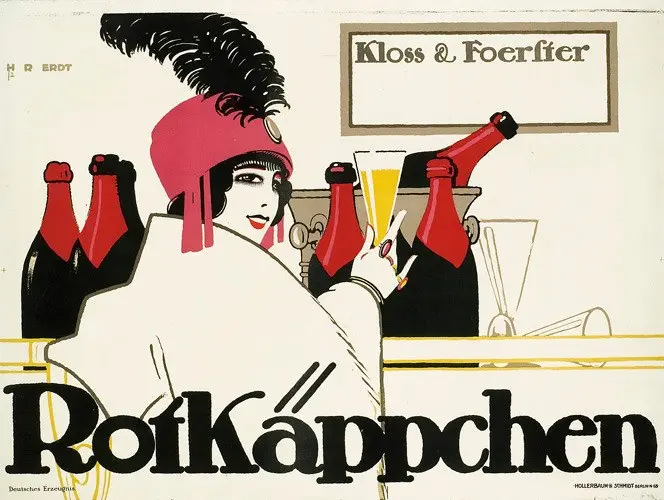
Little Red Riding Hood
Hans Rudi Erdt
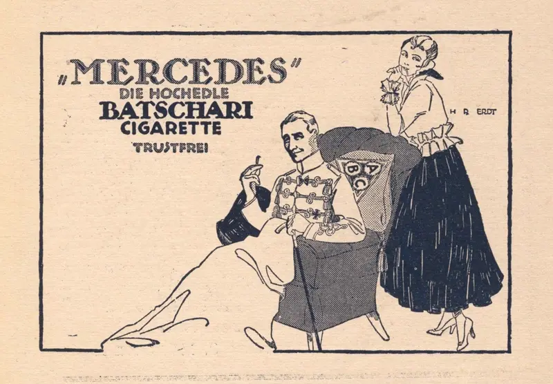
Mercedes — Batschari Cigarette
Hans Rudi Erdt
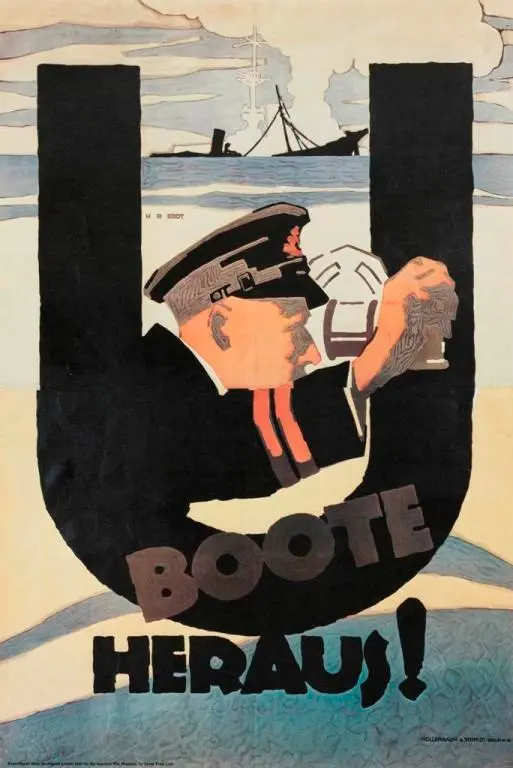
U-Boote heraus!
Hans Rudi Erdt

Manoli
Hans Rudi Erdt